Friday, June 12, 2015

Diana Ross


It's been a while since I posted something on here. Sorry about that. There were a few performers I wanted to paint since the last time I did a portrait for TGIF. Sadly, it just didn't work out. Some just slip through the cracks and sometimes stories get dropped. Some big regrets. But I was glad to do this one of Diana Ross.
Here's some details —


Here's the full cover —
See more on this story at honolulupulse.com

Thursday, April 03, 2014

Kawaii Kon 2014


I haven't posted in a while. Sorry about that. But here are two items going up for auction at Kawaii Kon this year. Hope you enjoy. The first was inspired by the anime "Kill La Kill" and the other by the animated short "Paperman."


Friday, March 29, 2013

Bill Cosby


Comedic influences when I was a kid: Robin Williams when he was doing stand-up, Eddie Murphy, and Bill Cosby. His stand-up, The Cosby Show—everything he did I loved. His show introduced me to Ray Charles. He even reminds me of my grandfather. I grew up with this man. I love this man. So why wouldn't I paint a cover when I had the opportunity to.

Here's a detail:


And here's the full cover:


This has to be my most favorite portrait so far. Very fun doing this.

Tuesday, March 26, 2013

Equal Marriage Rights and Bacon


Just supporting equal marriage rights and my love of bacon at the same time.

Saturday, March 16, 2013

Kawaii Kon 2013

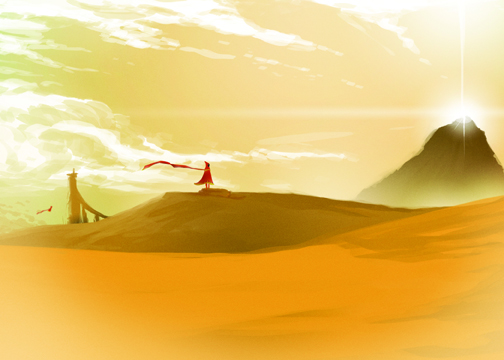
Every year, I participate in Kawaii Kon's art auction. I rarely sell my work during the rest of the year because, honestly, I don't like to. I'm too attached sometimes and other times, I think no one will like it. This year I had three pieces for sale, and all three have found happy (I hope) owners. The piece above, "Wheel in the Sky," sold for the most. It was my favorite of the three and is based on the video game, "Journey." (I hope you get the 80's music pun.)


"Adventure Time" is a show I got into because of my nieces. And guess what. They grew out of it. I didn't. I still love the strange, adult (sometimes dark) humor. No other show can pull off their main character liking faux meat meant to taste like humans. Kids are lost to it. Eccentric adults love it, like the one that bought this. It was the smallest of the bunch, but the one I had the most fun making.


I reviewed "Portal 2" for my newspaper's video game blog when it came out in 2011. Next to "Uncharted 3" it was my favorite game of that year. This one had two pieces to it that played off the game's concepts. The main character, Chell, was porting from one picture frame to another. This is the piece that got the creative train going on the rest of the other pieces. It was sold at silent auction and the last time I checked, it was going for more than I thought it would go for. In total, I made enough to renew my car's registration. One last thing to worry about.

I'm glad other people were so excited about these pieces that they went for what they did. I suppose I will never know what others will like until I put it out there.

Tuesday, February 19, 2013

Hold These Truths


This is one of the few TGIF covers where text is the star. If I had it my way, it would have been black and with text and nothing else. You can see what I mean below.


It would have gone against the grain but I think I could have made it work. The Star-Advertiser has a policy where photos are king. But recently, this trend of text being the center of attention is hopefully something I can build on in the future (without getting a mouth full from people on the top floor.) Still, one of my favorite covers yet.

Saturday, February 02, 2013

Return to Sender

Sometimes, when I'm cooking, I have way too much time on my hands.

Tuesday, January 08, 2013

Manti Te’o

Manti Te’o was nearly awarded the Heisman trophy. As a tribute, we ran an extensive profile in a special section by the Star-Advertiser Sports staff. They asked me to do a cover and this is what they got. Not very happy with the left side. Would have been remedied if I had more time to work on it. Though the same could be said about Notre Dame's offense. OH!

Here's a detail:

Friday, November 23, 2012

Jake Shimabukuro

There are certain local artists that I've been waiting on to do a portrait for TGIF. Certain factors have to line up to get an event or person on the cover. I got lucky in this case because Jake Shimabukuro is one of my favorite local musician. I was a fan of his first band, "Pure Heart," and being able to do this TGIF cover on his upcoming "Jake Shimabukuro and Friends" concert was a big honor.

Here's a detail:
And here's the final cover:

Tuesday, November 13, 2012

Myriad Joe

I love doing ambigrams. I also love the font, Myriad Pro. Why not combine the two? So I did with my name. It's a constant battle with myself and my ego. Conceded.


EDIT: Guess I should put my last name up here too. Different styled ambigram.


Friday, November 09, 2012

Wampire!

Anyone else look at a "w" and think "vampire teeth"?


The Nutcracker

Hawaii Ballet's "The Nutcracker" has a really great logo they've been using for a few years now. Designed by Wall-to-Wall Studios, it features a brilliant double image (http://www.walltowall.com/news/view/71), which is something I love doing. This was most evident in my TGIF cover for Phantom of the Opera, pictured below.


For "The Nutcracker" cover, I tried the same approach. I don't think it was as strong as the Phantom cover, but I think it was decent enough for a blog post.


Here's the final version with text. It feels more complete with a font on there:


I really think Wall-to-Wall Studios designs are far more superior. Sadly, I only had an hour or two to work on this decent cover. Trying for better next time.

Monday, October 08, 2012

2012-2013 Ilima Awards Cover


The ‘Ilima Awards is a yearly restaurant guide printed by the Star-Advertiser. I had a very clear idea on how I wanted this year's cover to look like. I was very surprised at how accommodating some chefs were at providing elements for the cover, though most of the food we bought and brought in. Photos were shot by the fantastic Craig Kojima with design and photo manipulation by me. It turned out much better than I expected it would.

Monday, July 23, 2012

Melissa Etheridge

This cover really helped me establish how I wanted to treat these portraits. Simple color(s) contrasting with the detail of the subject. I think I'll be experimenting with that more.

Click on the photos see a larger version. Here's a detail.

Here's the cover. For the story, visit honolulupulse.com.